Brand Settings: CTA
Last updated: April 7, 2026
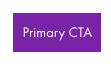
The CTA tab allows you to fully customize the visual style of your call-to-action buttons—Primary, Secondary, and Tertiary, so they align with your brand and feel visually engaging across your assets. Each section includes controls for Text color, Font (weight & size), Rounded Corners, Padding, and border
Letter Spacing
Controls the space between each character in your button text. Increasing letter spacing can improve legibility or give a more modern, airy look.
Examples:
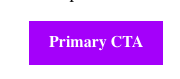
A value of 0 keeps letters tightly spaced (default for most fonts)
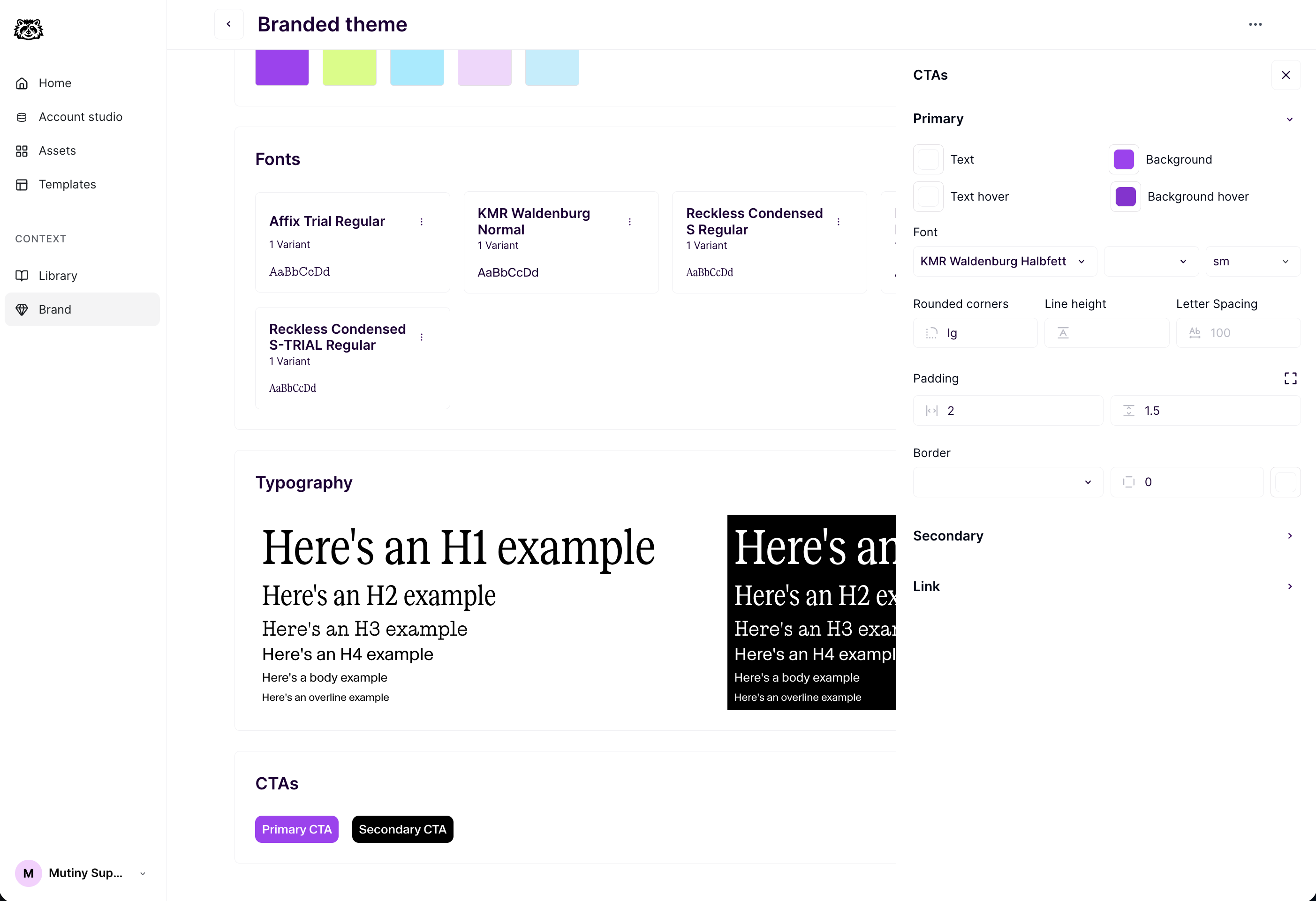
A value of 1px or adds a subtle spread
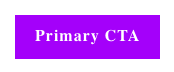
A value of 2px or adds a much larger spread
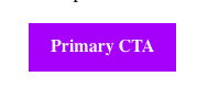
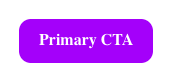
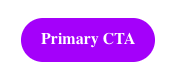
Rounded Corners
Defines how rounded the button corners are.
Examples:
0px = sharp, square edges
12px = soft, slightly rounded corners
50px or more = pill-shaped button
Padding
The space inside the button between the text and the edge of the button. The two settings options give you control over the side padding and the top padding
Examples:
20px side padding with 10px vertical padding:
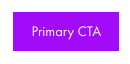
10px side padding with 10px vertical padding:
Need Help?
If you have questions or need help, the Mutiny Support team is here for you! You can submit a support ticket using the Submit a ticket button at the top of this page, or reach us at support@mutinyhq.com.