Brand Overview
Last updated: April 7, 2026
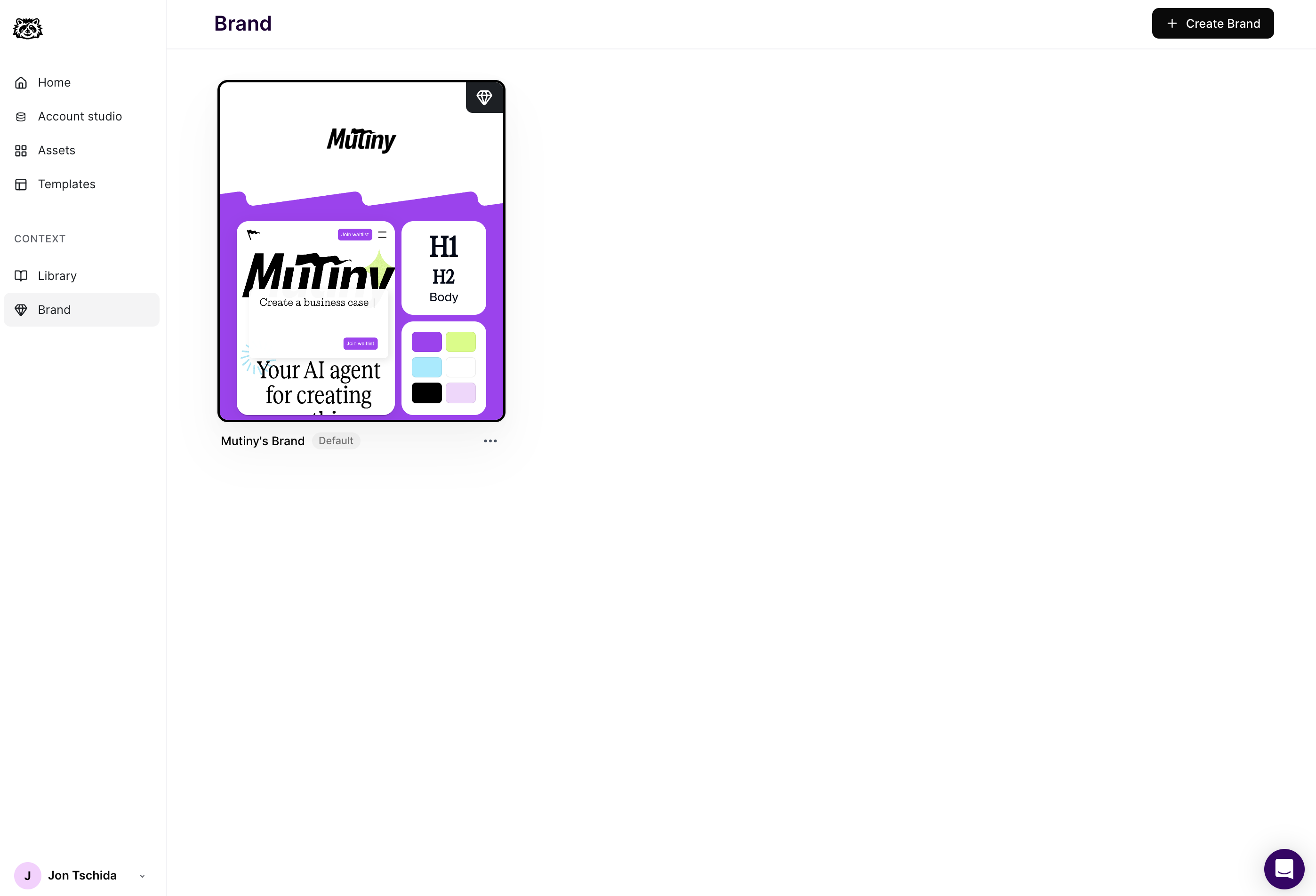
Brands in Mutiny allow you to define a cohesive, on-brand design system that applies across all of your personalized assets. By centralizing control over colors, typography, buttons, images, layout elements, and drafting visual guidelines that the agent will follow, you can quickly build assets that are both visually consistent and flexible enough to adapt to different audiences without needing to write any custom code.
These settings ensure everything looks aligned with your brand from the very first impression.
Available Theme Settings
Click into any section for a deeper explanation of how it works and how to customize it effectively.
Visual Guidelines
Colors
Define your brand’s primary, secondary, and tertiary accent colors to easily apply them across buttons, links, backgrounds, and other elements throughout your assets.
Fonts
Upload and manage the fonts used in your experiences. Choose from Google Fonts or upload custom font files to keep typography consistent with your brand guidelines.
Typography
Set the default font family, size, weight, line height, and letter spacing for elements like headings, body text, links, and CTAs to ensure clear hierarchy and readability.
CTA
Customize the style of your primary, secondary, and tertiary call-to-action buttons. Control font styles, padding, background and text colors, border radius, and hover states for each CTA type.
Need Help?
If you have questions or need help, the Mutiny Support team is here for you! You can submit a support ticket using the Submit a ticket button at the top of this page, or reach us at support@mutinyhq.com.